Choosing a Brand Colour Family

So you’ve selected your main brand colour for your logo, but how do you choose additional colours that “work” with it? Here’s a quick guide to how to choose a colour family for your brand:
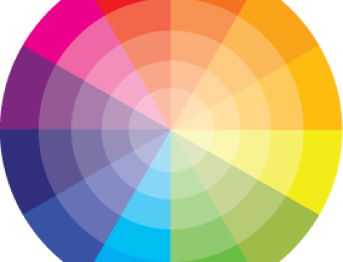
Colour theory is a basic guide of how to use colour. The colour wheel is the best visual aid when starting to decide on which colours to use. Separated into a circular rainbow, the wheel makes it easy to choose complementary colours using one of the following rules: OPPOSITES, ANALOGOUS, TRIAD, QUAD, or (what we like to call) NEIGHBOUR OPPOSITES.
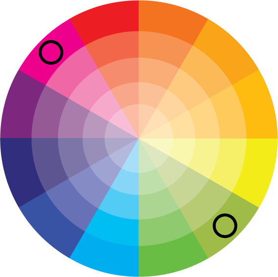
OPPOSITES
On the colour wheel the colours directly opposite each other will complement each other, often in a bright contrasting way. Some are better than others when used on screen, for example red and green of the same depth of tone next to each other doesn’t work too well.
Examples:
- RED and GREEN
- BLUE and ORANGE
- PURPLE and YELLOW
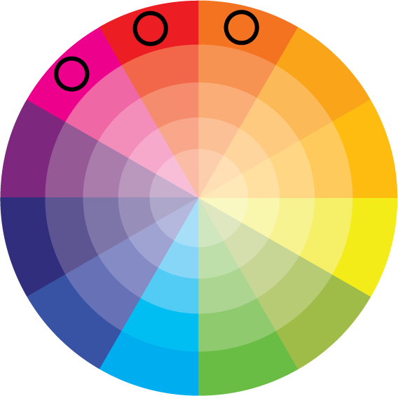
Analogous or harmonious colours appear on the wheel as direct neighbours, usually you would choose two or three neighbouring colours to create a harmonious colour scheme.
Example of analogous group below:
- RED, ORANGE and YELLOW
- GREEN, LIGHT BLUE and BLUE
- PURPLE, VIOLET and PINK
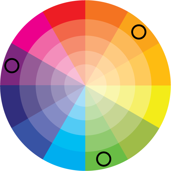
Triads are three colours separated equally on the wheel – if you were to mark each one they would create an equilateral triangle. This can be used again for a contrasting scheme, so that buttons on a website stand out against a background for example. The most obvious of the triads are the primary colours: Red, Blue and Yellow.
Examples of triads below:
- PURPLE, ORANGE and LIME GREEN
- RED, YELLOW and BLUE
- PINK, LIGHT ORANGE and BRIGHT BLUE
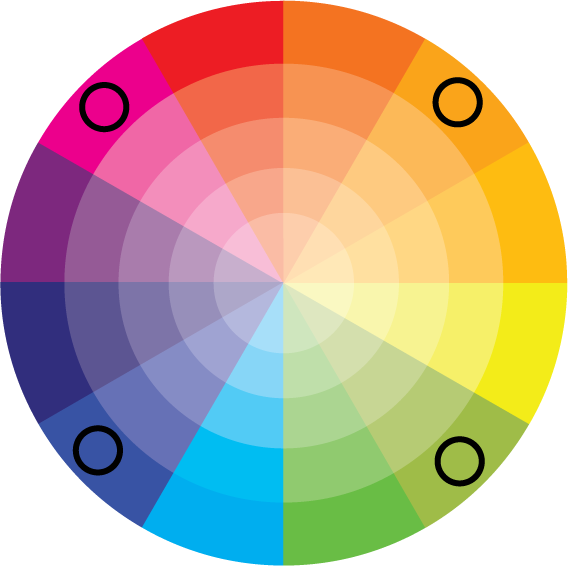
Quad colour schemes sit on four points equally around the colour wheel making a square shape if you were to mark each one. They are particularly useful when designing big printed articles with multiple sections or for websites that contain a lot of information. They can be grouped in two’s, with more harmonious or clashing colours used together, and can be very dynamic.
Examples of quad schemes below:
- PINK, BRIGHT ORANGE, LIME GREEN and BLUE
- RED, LIGHT ORANGE, GREEN and DARK BLUE
- ORANGE, YELLOW, LIGHT BLUE (CYAN) and PURPLE
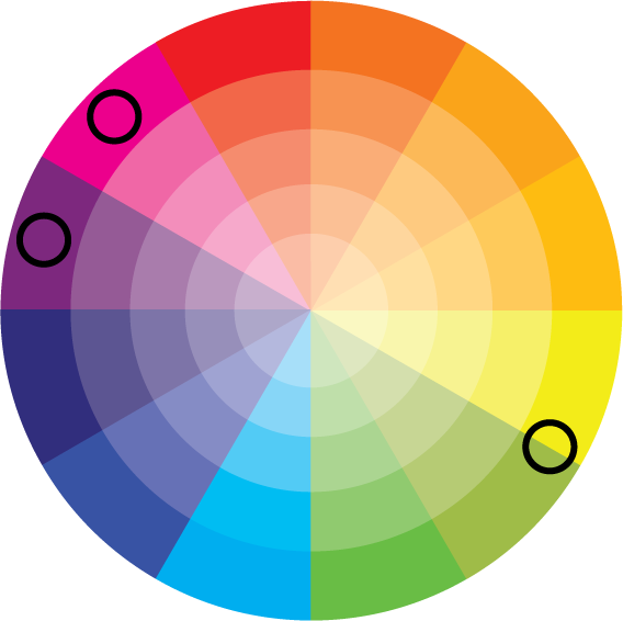
One of the most dynamic of colour schemes to choose from is what we call neighbour opposites. Choose two or three neighbouring colours on the wheel, and then the one directly opposite.
Examples of neighbour opposites below:
- PURPLE and PINK – plus CITRUS GREEN
- ORANGE and BRIGHT ORANGE – plus BRIGHT BLUE
- GREEN, BRIGHT GREEN and YELLOW – plus VIOLET
If you choose colours using the above guidelines it takes the element of chance away from colour selections to ensure that you have a cohesive brand image. Now you don’t have to worry that the colours will “jar” and can be confident they will be easy on the eye.